
<the-idea/>
That's life, Stavanger. A brand that talks like the bartender.
Sånn er livet, Stavanger.
<voice/> That's life, Stavanger.
<the-story/>
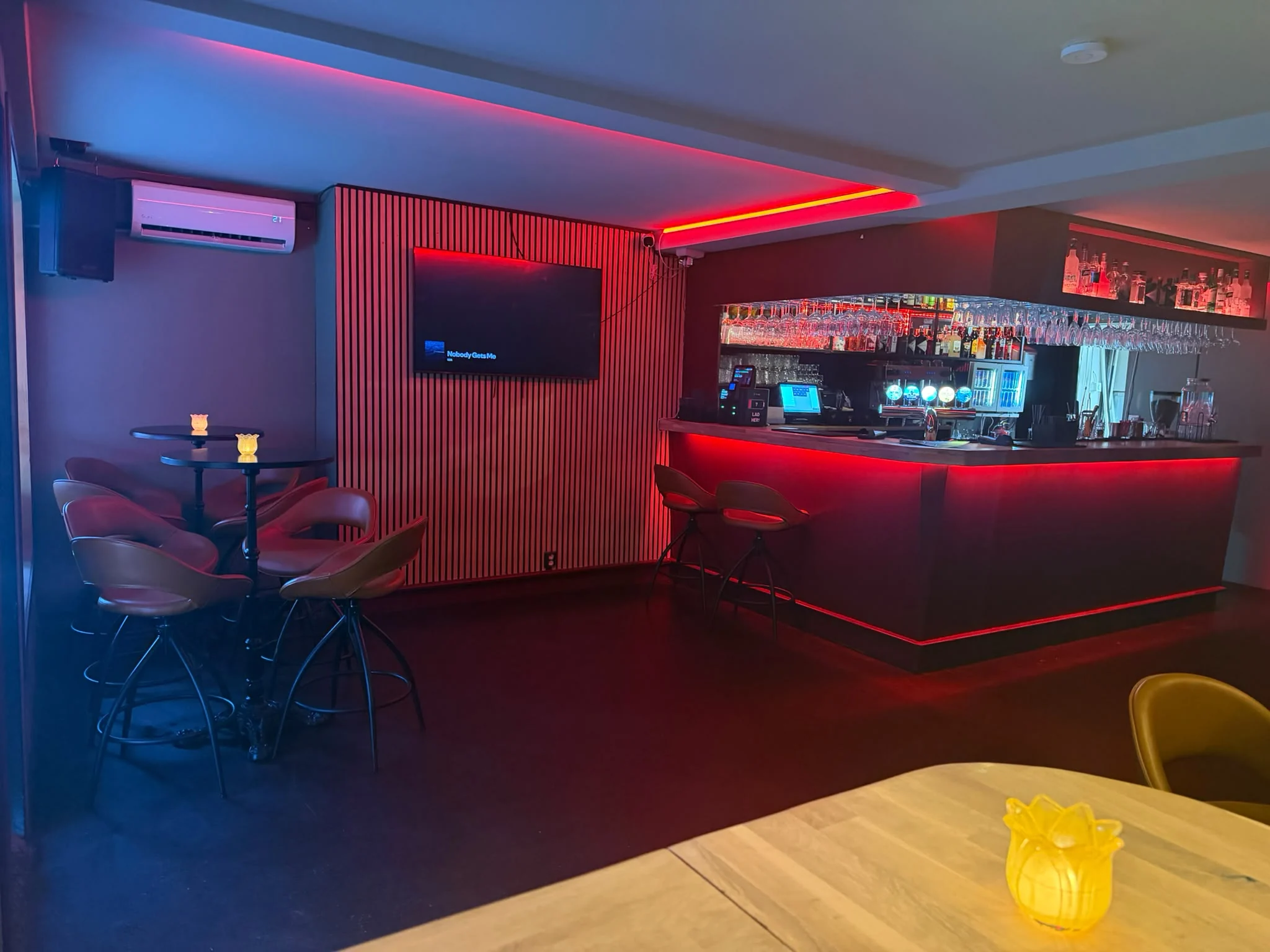
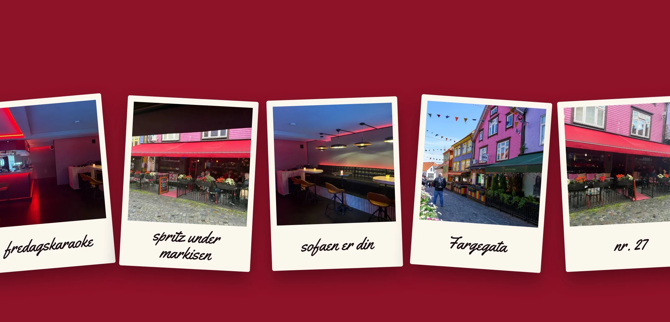
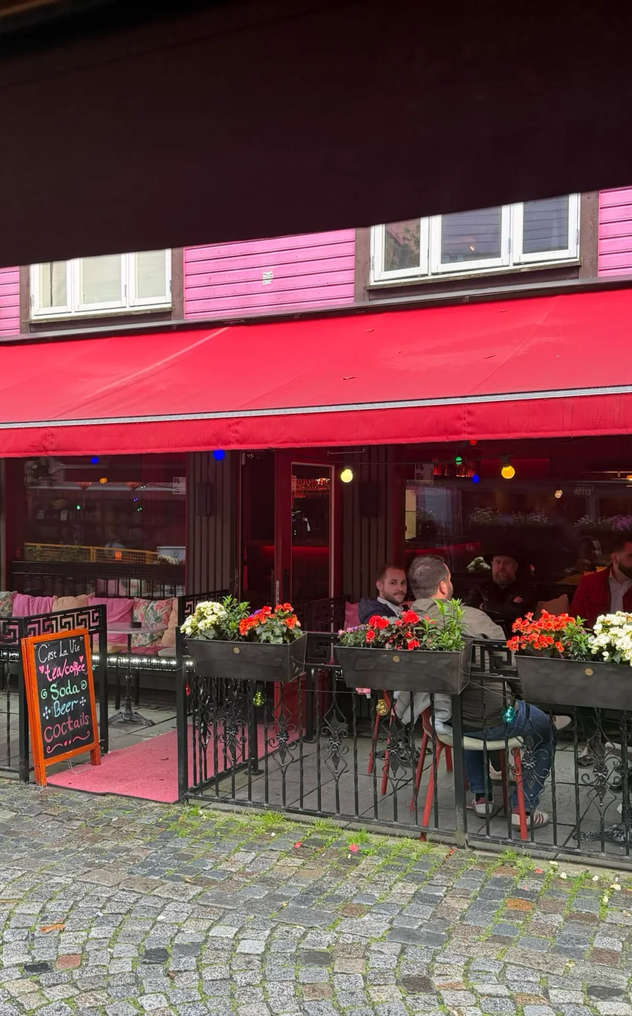
The guys behind the lovely cocktail bar in Fargegata in Stavanger gave us their full trust, and we're glad they did. We had free rein to set the whole direction ourselves, and to put our creative heads together to make a new brand. A new feeling.
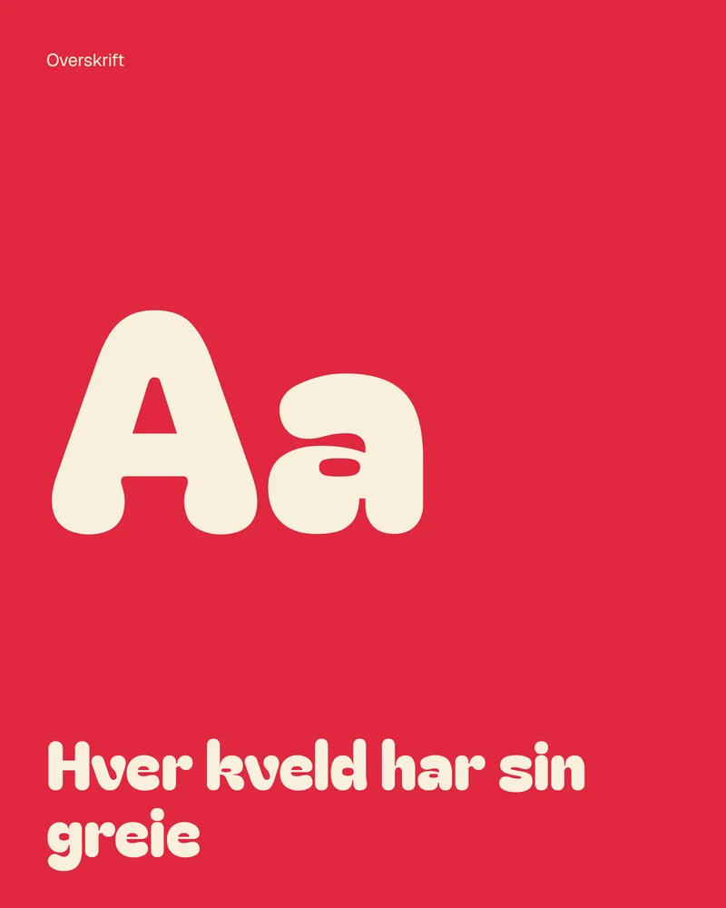
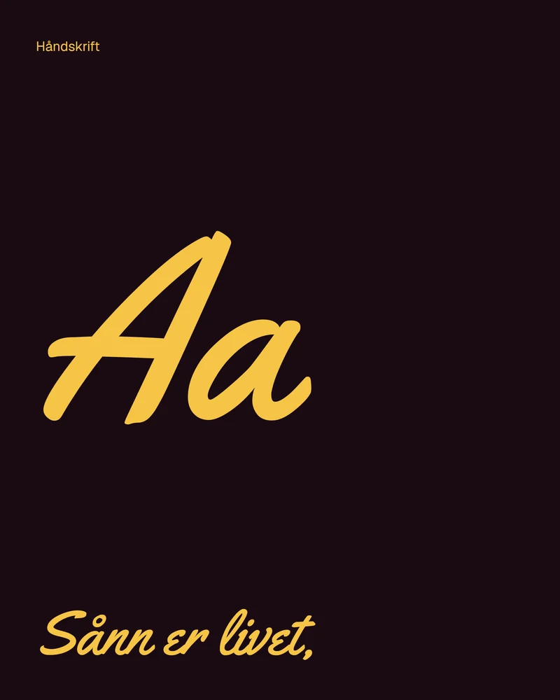
That's how C'est la vie was born, with colours and a website that stand out from the crowd. We also wanted typefaces that are anything but your usual standard, something that shouts “Hey Stavanger!” and turns a few heads.
The concept is built on what the owner wants to do, from company parties to karaoke, with better prices on drinks than the rest of town. C'est la vie is where it happens!
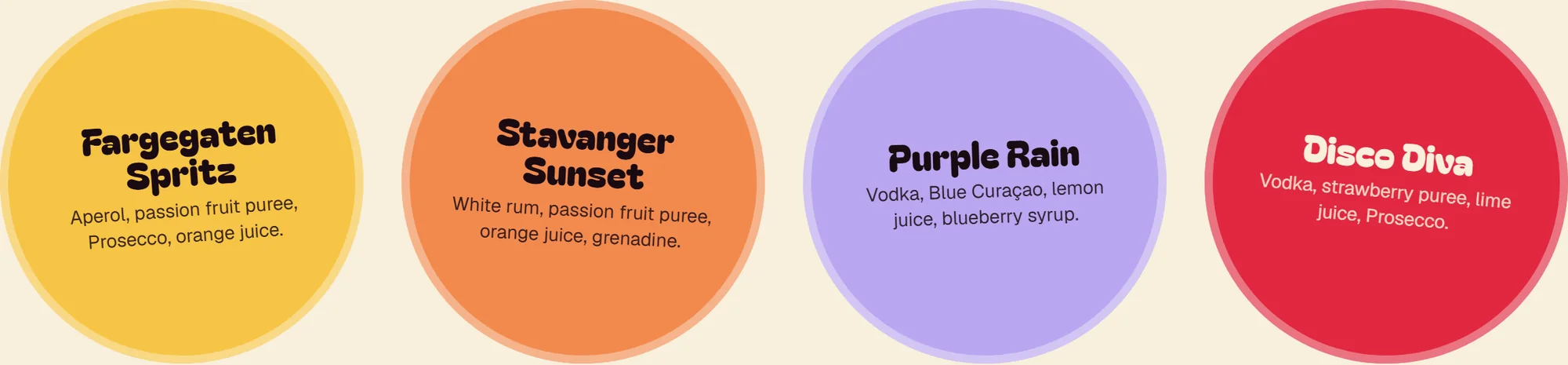
The mats roll onto the table.
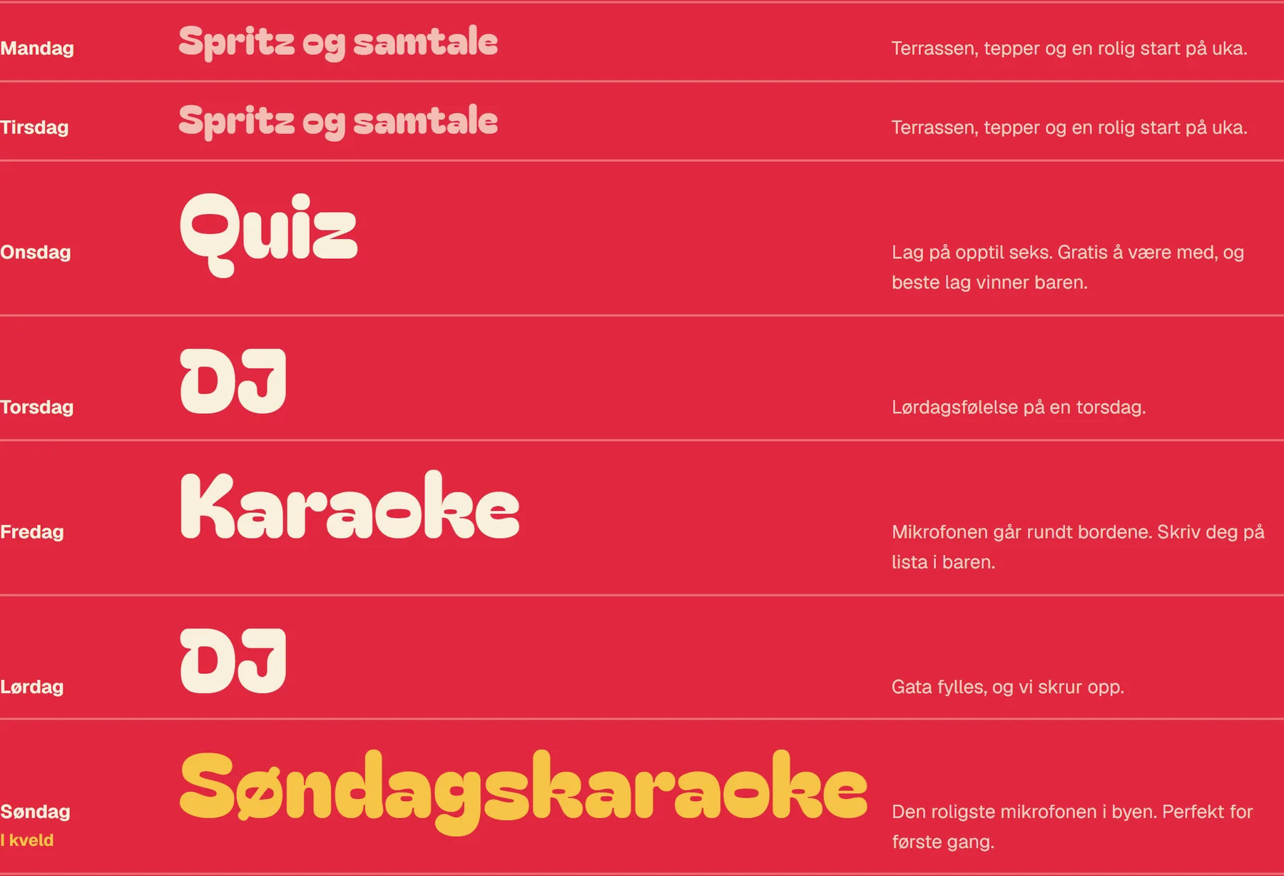
Behind the brand stands a full website: a programme for every night, a drinks list you can find your way around, and every page in its own colour. The house drinks roll in like beer mats as you scroll.
- 7/
- nights, each with its own thing
- 15/
- categories on the drinks list
- 4/
- house drinks on their own beer mats
Need the whole package/
Name, colours, tone and website. We'll take it from the first word.
<let's talk/> NextUniverse Profile/